
Tuesday, 28 September 2010
Some Homework: Rhiw drawing
Weekend after my first drawing session and decided to try a drawing using charcoal and adopting the same approach: defining objects in space, checking and shifting accordingly. I was working on an A3 sketchbook. This is where I got to after about an hour:
 The technique served me well in producing a reasonably well proportioned version of the view which was complicated. However, looking at it now there is very little sense of the palimpsest residue of where I have been. What Tony calls 'diary drawing': telling the story of my drawing. As a result it lacks any of the exploratory strength that comes from a wholehearted approach to finding your way. When i showed it to Tony he said 'Too much detail, and he was right too much effort to make it look right. A bolder sparer drawing could have been much more successful. Resist the pressure to fill in detail. Stick with the line shapes and spaces in between. The other thought I had was that i had had trouble applying the same approach to a smaller scale even though it was A3I
Tuesday, 21 September 2010
Day One: City Lit Fine Art Course. Drawing
Started with lots of encouraging introductions (some tedious, but mostly informative and even inspiring). Chris spoke of a big commitment:,. A full day a week for two years certainly feels like a big step. The best bit of the introduction was a run through the mobile portfolio of one of last year's students: a whole years work captured on her mobile. It certainly encouraged me in my modest blog aspirations, but far more significantly it gave us a thoroughly inspiring sense of the journey she took and we are just embarking on. From drawing to painting to printing to sculpture to photo shop and onward to our own personal project. Best of all was being able to see how she carried themes and ideas from one area of work to the next. Also well chosen because the standard was not dauntingly high but nevertheless showed a strong sense of sustained development and enrichment.
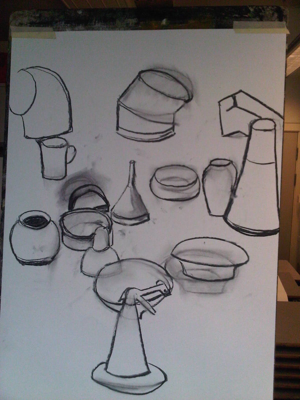
Then, finally, we begun. Tony Hull set us a taxing still life that built up as we drew. Two minutes on one object, then two minutes on another added object. As each on arrived it compounded the errors you had made with the previous ones. By the time lunch came we had ten objects and a drawing that looked hopeless:
 When we returned, Tony challenged us to start relocating the objects. Using negative space, vertical and horizontal locators, rubbing out and shifting each object into its rightful space. Then tackling scale with some proper measuring. Several things happened. There was what felt, at first, like a hopeless knock-on effect. Everything changed, each move affected something else; many objects just drifted off the page. It seemed hopeless, but then the moves themselves became part of the drawing. We were left with a kind of palimpsest of our own first efforts and errors. The lines too became part of the drawing. By the end of the afternoon, it suddenly began to feel like a passably accurate representation of what was there:.

We had to resist shading and going for detail. Concentrating instead on shapes and relationships. I was seduced into some shading just because so many of the shapes seemed to demand it. But by the end I realized that this sort of finishing tempts you away from the fundamentals of proportion, relationship and the spaces between. What I did wrestle with were the ellipses required for all the bowls. Always more curve than I could see. As ever it was an exercise, above all, in concentrating on what you can see rather than what you think is there. But also Tony had given me the realization that you can work on drawing int he same we as you work on an oil painting. You can keep kicking it around, pushing and pulling and the very process adds depth.
A great start.
Then, finally, we begun. Tony Hull set us a taxing still life that built up as we drew. Two minutes on one object, then two minutes on another added object. As each on arrived it compounded the errors you had made with the previous ones. By the time lunch came we had ten objects and a drawing that looked hopeless:

We had to resist shading and going for detail. Concentrating instead on shapes and relationships. I was seduced into some shading just because so many of the shapes seemed to demand it. But by the end I realized that this sort of finishing tempts you away from the fundamentals of proportion, relationship and the spaces between. What I did wrestle with were the ellipses required for all the bowls. Always more curve than I could see. As ever it was an exercise, above all, in concentrating on what you can see rather than what you think is there. But also Tony had given me the realization that you can work on drawing int he same we as you work on an oil painting. You can keep kicking it around, pushing and pulling and the very process adds depth.
A great start.
Tuesday, 14 September 2010
Two paintings in progress
A productive day allowed me to spend some time working on a couple of paintings I started over the summer and that have been scowling at me in my newly cleared art corner. The first is a rough oil of The Blue Lake near our cottage in Wales. It began life as a pencil sketch, followed by a very rough water colour both done at the location..


The oil painting below is starting to approach the more rougher impressionistic style I want to develop for my oil landscapes. Started with brush work and then with a layer of palette knife work. I worked today on the water trying to get some reflection into it. I think it is still too reticent. I need to have the courage of my convictions and use bolder colours and rough it up some more. However, the three separate elements work well and the composition is reasonable. The foreground rock is staring to zing a bit, (losing some of its texture and contrast in this not very good photo). However, I plan to return with more paint and more colour. It may disappear, but it might end up like sludge, but it is worth the risk.

And then I returned to a monochrome self portrait which I started from a photo. All the usual battles with eyes and the dreaded mouth. But I am pleased with the burnt umber monotone and some of sculpting is starting to look better. It makes me look like a glum bugger, which I usually do especially when I am struggling with a painting. It was inspired by a couple of dark portraits I saw at Charleston by Duncan Bell I think. It has gone its own sweet distorted way. However, it is a step forward and maybe I will return perhaps with a glaze.(Note: it doesn't reproduce very well. Too late in the day for natural light and the flash did it no favours)

Struggles at the British Museum


As promised a trip to the British Museum this morning. Three drawings which I enjoyed doing, although as ever, disappointed in the outcome. All done at A3 scale as encouraged by Andy Pankhurst whose course I did at the National Gallery (memo to self: I very much like Andy's work and want to add it to my reference collection..see below).
The first one was the Mexican figure: hands crouched around his knees in a very modern pose. He had a very Muppet-like mouth which I partly captured. Mouths are my downfall and this one should have been easy, but the curve was a lot more subtle than I could handle. I was pleased with the feet. But above all the real disappointment was failing to get the squatness. He was squat, he had weight and I have him almost thin. Getting my drawings to have weight and sit on the surface, is a recurring challenge for me.
The second is an American Indian figure done fairly quickly in charcoal. I felt better about this one and it reminded me of how much charcoal can free you up and allow the line and the shading to flow.
Finally, I found a delicate tall and thin Buddha. Its delicacy was a challenge and here the trick was get the lightness of the form. I probably didn't spend as long as I needed to and was also unsure whether this was going to be a line drawing or fully shaded. In the end it was half and half and less satisfactory for that. The rather strange leg and foot crossed on the front really did look a bit like that. Difficult to look graceful.

And here's one of Andy's life paintings. The simplicity is beguiling, but the sort of thing that is so much harder to pull off than it looks. I particularly like his use of colour in the backgrounds. there are several of these with wonderful rich red background. here the mix of colours works just as well.

Sunday, 12 September 2010

This was an important gallery visit. The first in my newly found 'art days'. Next week my course begins. But this was in my own time. No constraints, in fact I watched virtually all of the 90 minute film about Neel made by her grandson. Now that was psychological: much if it told through the slightly tortured testimony of her two sons. Watching it without a deadline, then returning to the pictures. It was rewarding in just the way I had hoped this time would be.
BUT, that is just looking. Important in itself. This Tuesday I will look and draw. That requires proper looking and it is still a struggle every time. I am off to the British Museum: a good place to look and may mean that I just possibly post one of my own drawings! Now that will be a step.
Getting Started
This is really an experiment. A tentative first step. Not even sure that a blog is the way to go. At the moment I wrestling with the technology. Not an auspicious start. That is why for the time being there will be a few vacuous posts just to see whether this is going to work. I fear embarrassment. I feel as if I have come to this too late. Then I may well have come to art too late.
Subscribe to:
Posts (Atom)